Nano Banana Pro vs Nano Banana 2: Same Prompt, Nine Images, Three Real Differences
There is no shortage of comparisons between these two AI image models. The problem is that most of them just post pictures without stating the conditions. Different prompt, different aspect ratio, sometimes even a different resolution — and then a verdict. You can't do anything with a conclusion like that.
So I locked every variable: same prompt, same aspect ratio, same resolution, only the model changes. Three scenarios plus one side experiment, nine generations in total. Here is what showed up, including the places where both models fell over.
Why these two get compared in the first place
In the model list on the AI image generator they sit right next to each other, and their parameter panels look nearly identical: prompt, aspect ratio, resolution, reference images, 1k / 2k / 4k, ten aspect ratios each. Most people's first assumption is that Pro is simply the more expensive one.
They are not two tiers of the same thing. One name carries a spec, the other a generation number, and the differences that actually matter aren't about which one looks sharper. Run them side by side and you find that the two models read the same sentence differently.
The test conditions, up front
All three prompts were written in English, in one pass, and not edited afterwards. Two images per round, identical parameters except the model:
- Crowded scene and text rounds: 16:9, 2k
- Character round: 1:1, 2k, both models fed the same reference image
- Nano Banana 2 left on its default thinking level (except in the side experiment)
The reference image for the character round is a separately generated casting shot: grey backdrop, even frontal light, no makeup, eye-level camera. That kind of clean baseline is a precondition for testing character consistency — with a busy background or directional light you can no longer tell whether the model drifted or the reference simply carried too much noise.
If you'd rather not fire these off one at a time, this sort of side-by-side is easier to run on the generative canvas: branch one prompt into two nodes and leave the outputs sitting next to each other.
Round one: a crowded scene
The prompt described an early-morning street food stall: six dishes, a vendor in a white apron handing over a paper bag, people queuing behind, a stack of bamboo steamers on the left, a bicycle against the wall on the right, hanging bulbs, morning haze. Deliberately a lot to hold.
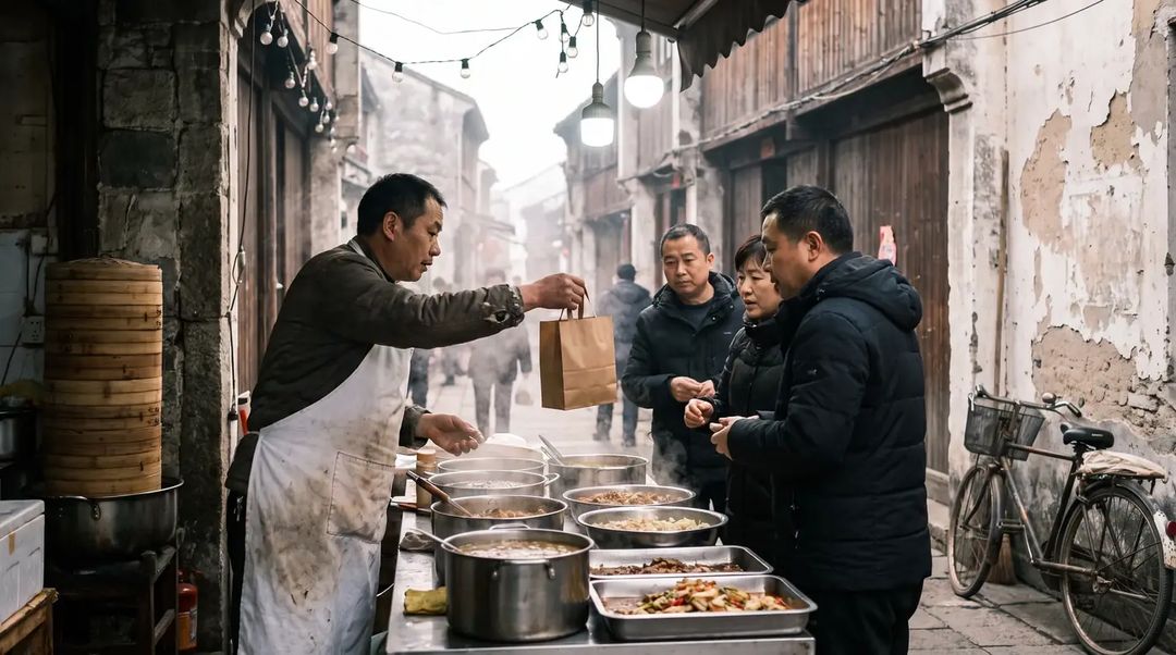
Nano Banana Pro returned something that reads as photography. Consistent cool grey, clean depth, the haze and the light agree with each other, and most of the requested elements are present. But its reading of the scene is restrained — the counter holds a few stainless steel basins and you couldn't say whether that's six dishes or four. There is no signage anywhere.
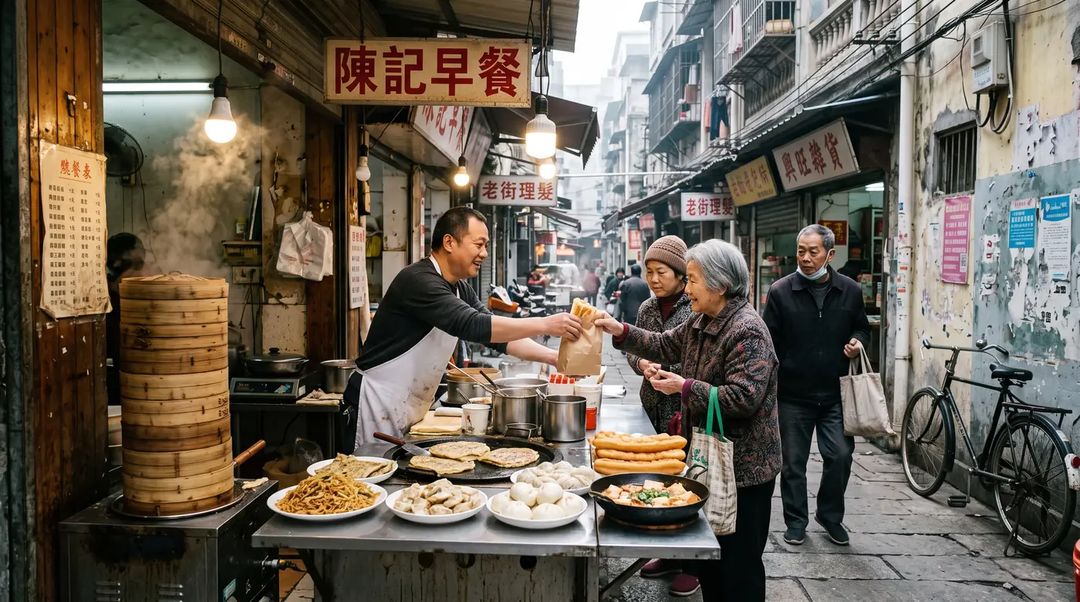
Nano Banana 2 packed the frame instead: fried dough sticks, steamed buns, dumplings, pancakes, noodles, tofu — six or more, countable at a glance. A shop sign hangs on the wall, two more are visible down the street, and someone has stuck a payment QR code on the doorframe. None of that was in the prompt. The model added it.
On "six different dishes" the second image is closer to what I asked for. On atmosphere I prefer the first. I'm not calling a winner here, because the answer depends on whether you want mood or information density.
Both broke in the same place: hands. In the Nano Banana Pro image, the vendor's left hand hovering over the pot has fused fingers. In the Nano Banana 2 image, the handover of the paper bag turns into a smear where the two hands meet. Human interaction is still the most fragile part of the frame, and neither model has solved it.
Round two: keeping the same face
This round changes exactly one thing: put the person from the casting shot on a street at dusk, add warm low side light, blur the shop signs behind her. The prompt explicitly asked for the same person, same camera angle, same framing.
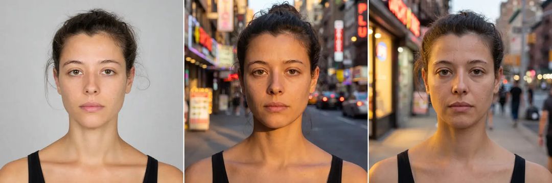
Reference on the left, Nano Banana Pro in the middle, Nano Banana 2 on the right.
Nano Banana Pro moved her over more or less untouched. Brow shape, eye spacing, the width of the nose bridge, the lip line, the hairline — even the loose strands and the black tank top survived. You would read it as the same person photographed on a different day.
The Nano Banana 2 version is recognisably "someone who looks like her", but she changed: wider face, squarer jaw, coarser skin, several years older, hair flatter against the head. On its own it doesn't look wrong. Next to the reference it plainly is.
If you're making anything where one character has to recur across images — a storyboard, a picture book, a poster series — that gap alone decides the model for you.
Don't hand Pro the trophy yet, though. The prompt asked for the same framing, and both models moved the camera in on their own: the reference is a head-and-shoulders shot, and both outputs came back as tight close-ups. Neither one listened.
Round three: text inside the picture
I expected this to be the round where everything fell apart. The prompt called for a handwritten café chalkboard reading exactly OPEN TODAY 7AM - 4PM, with a smaller line underneath reading FLAT WHITE 4.50.
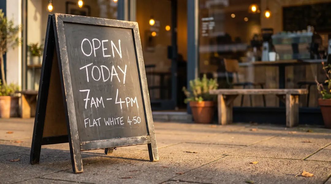
Nano Banana Pro got all three lines right, and the chalk strokes are convincing. It wrote the price as 4·50 with a mid dot, which is a normal way to hand-letter a price on a board, so I'm not counting it as an error.
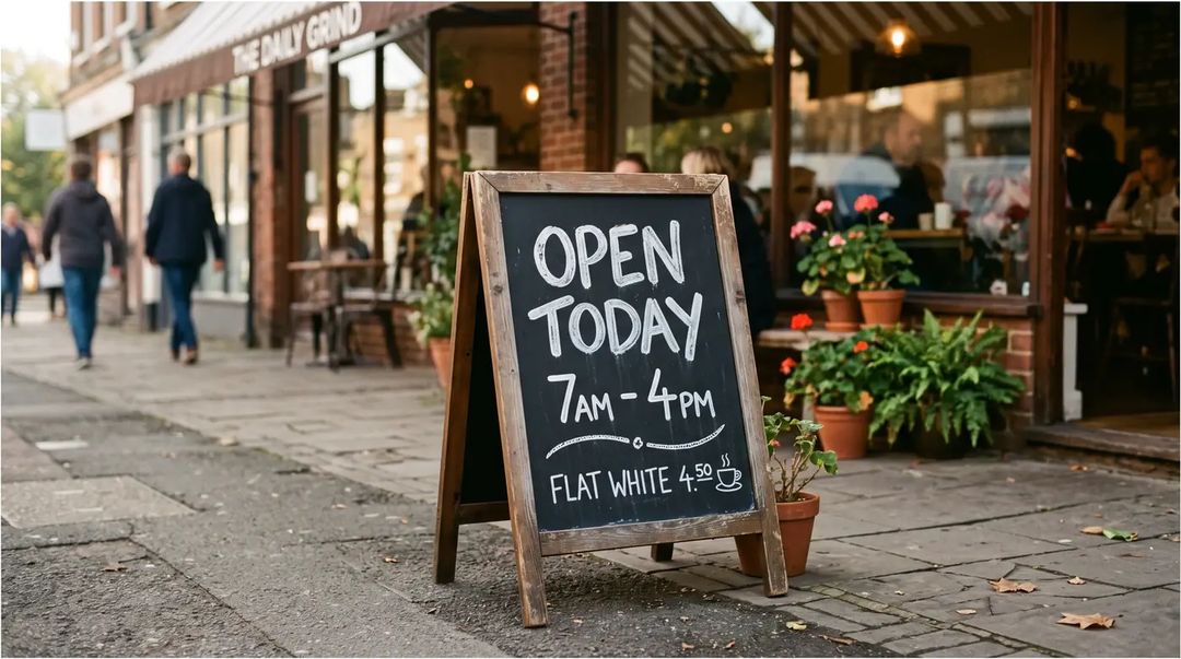
Nano Banana 2 also got every requested line right, then threw in a coffee cup icon and a decorative flourish nobody asked for — and broke in the one place it wasn't asked to write at all. The shop name on the awning should read THE DAILY GRIND; the first word collapsed into something illegible.
The pattern held across all three rounds: text you explicitly ask for comes out correct on both models now; the errors are always in the text the model added by itself. Same story in the street scene — the signage Nano Banana 2 invented was legible, while the tiny price list it also invented is pure gibberish. If you need reliable lettering, put the exact words in the prompt and leave the model as little room to improvise as you can.
One footnote: of five Nano Banana 2 outputs, one came back with a white border around all four edges that had to be cropped off. It happened once, so I won't call it a defect — but it's worth a glance when you're generating in bulk.
What Nano Banana 2's "thinking level" actually does
This is where the panels genuinely differ. Nano Banana 2 adds two switches: image search, and a thinking level you can set to minimal, default or high. Nano Banana Pro only offers web search.
I took the street scene prompt and ran all three levels once each.

Minimal, default, high, left to right. The core elements survive in all three — vendor, paper bag, queue, steamers, bicycle, nothing dropped. What changes is elsewhere: the higher the level, the less text the model invents, and the more of it is correct. Minimal is the busiest, with several posters whose small print is mush. High kept only a vertical shop sign and a couple of clean, readable price boards, and the composition visibly calmed down.
So it behaves less like a quality tier and more like a dial for how much care the model takes. The cost is time: high took around a hundred seconds here against a bit over sixty for default, nearly half again. Single observation, queue time included — don't treat it as a benchmark, but the direction is clear.
Which one to pick
After nine images, my conclusions got more specific than they started:
If one character has to recur, use Nano Banana Pro. The gap in the consistency round isn't a matter of taste; it's a matter of whether the output is usable.
If you want a dense scene that grows its own detail, use Nano Banana 2. Its imagination about environments is livelier, and signage, stickers and props you never mentioned will fill themselves in — handy for backgrounds and mood plates.
If the picture needs accurate lettering, either will do, but nail the words down in the prompt. Don't count on anything the model writes of its own accord.
When in doubt, prototype on Nano Banana 2. It costs a little less per image and its default level is faster, which makes it good for finding the prompt; once the direction is settled and the face has to hold, switch to Nano Banana Pro for the final.
If you want to change one region rather than redraw everything, neither is the first choice. Use the AI image editor instead — paint the area, change only that, no re-rolling the whole frame.
One last honest note: I ran each round once, with no repeated sampling, and a different seed could flip an individual finding. If you're deciding for a real project, take your own prompts, lock the variables the same way, and run each a few times. If you'd rather skip the setup, the ready-made configurations in the template library are a reasonable starting point.