GPT Image 2.5 vs GPT Image 2: I Ran the Same Prompts Through Both. Here's Where They Actually Differ
OpenAI shipped ChatGPT Images 2.5 on September 8 and summed it up as "sharper details, more precise editing, and faster generation." On the API side that means two new models, GPT-Image-2.5 Flare and GPT-Image-2.5 Sunburst. ZOOOP had both live the next day, as two versions of one model inside the AI image generator.
Launch posts always read well. If you generate images every day, there is only one question worth answering: I'm happy with GPT Image 2 — what do I actually gain by moving to 2.5? So I ran the same batch of prompts through both generations and changed nothing but the model. Here is what you can see, and what you can't.
What GPT Image 2.5 is, and what Flare and Sunburst are
Names first, because OpenAI released three of them at once.
ChatGPT Images 2.5 is the product name inside ChatGPT. There is no API model called "2.5" — there are two: Flare and Sunburst. Per OpenAI, Flare is the default for most applications and delivers higher-quality images than GPT-Image-2 at half the latency. Sunburst is built for premium workflows that want tighter control across edits, and it takes longer to generate. The two share the same prompts, parameters and aspect ratios.
On ZOOOP we didn't list them as two separate models — that would suggest you're choosing between two different things. They're two versions under GPT Image 2.5, one switch apart. That's also why every comparison in this post runs on Flare by default; Sunburst gets its own section below.
Compared with GPT Image 2, three things changed at the parameter level: the quality ladder goes from Low / Medium / High to five tiers, with XHigh and Max on top; there's a new 4K resolution; and a single request now takes up to 16 reference images instead of 10. Everything else is the same — eleven aspect ratios, prompts written the same way.
Method: same prompts, only the model changes
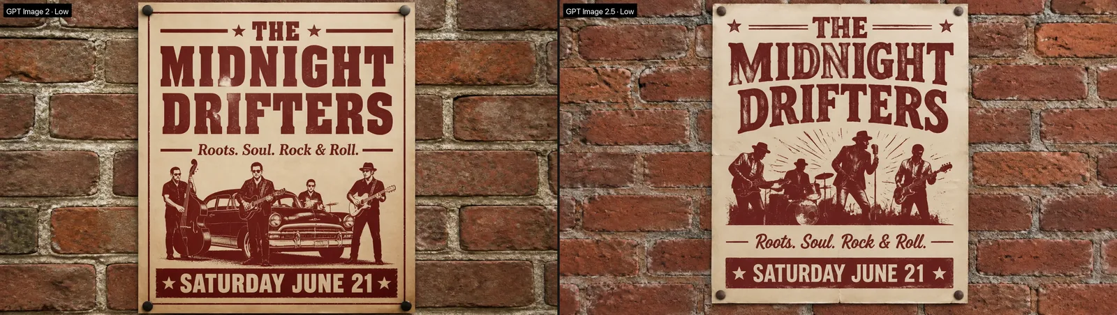
Four prompts, covering the four things I care about most. Fabric and metal detail: a close-up of a navy herringbone blazer lapel with a brass collar pin. Small text in the frame: a hand-painted wooden bakery sign. Reflections and materials: a matte black teapot on a polished stone counter. Typography: a vintage concert poster pinned to a brick wall.
Each prompt ran once on each model — 16:9, same resolution, Low quality. Low is the tier I use most, and it's the one that exposes a model's floor; any model can pile on detail at the top tier. For the fabric prompt I added a High pair and one Max render, which only 2.5 offers, to see how far the ladder actually goes.
Not tested here: editing and multi-reference compositing. Those are the areas OpenAI talks about most for 2.5, and they deserve a post of their own.
Difference one: resolved detail
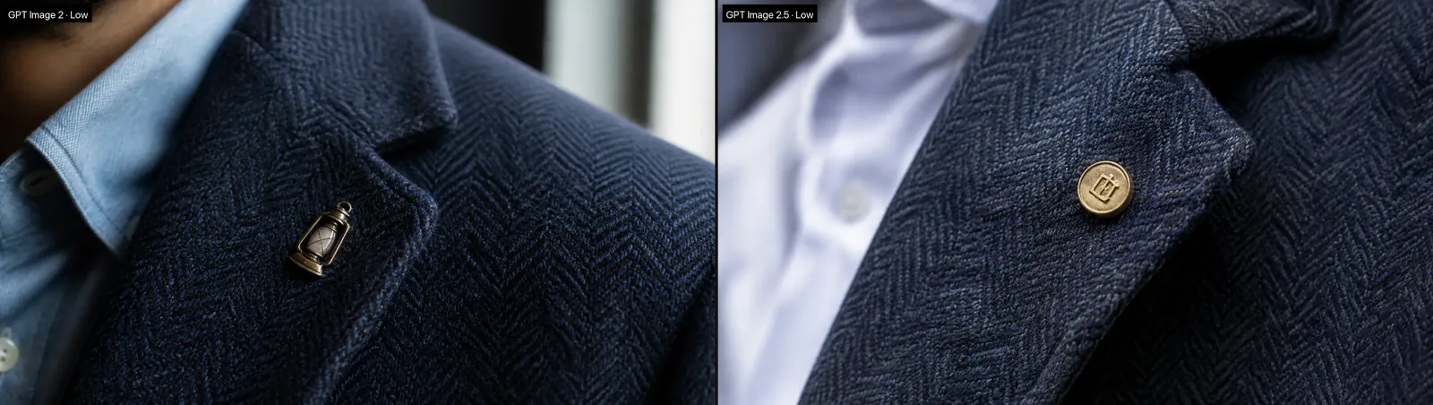
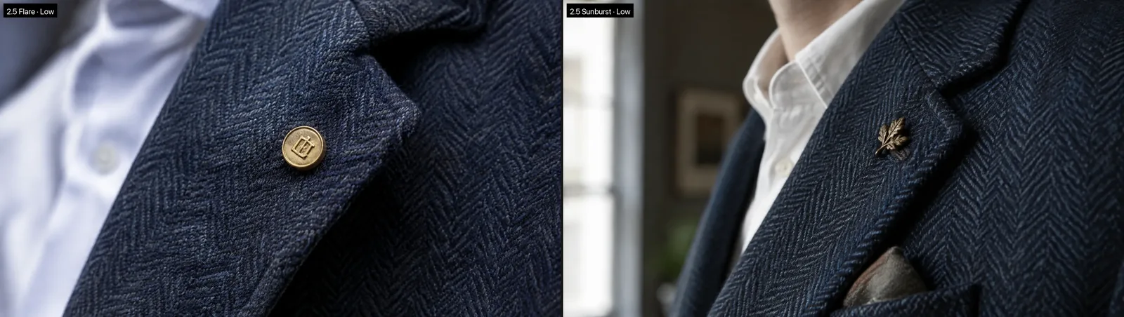
The short version: both Low renders are usable; the gap shows up when you zoom. GPT Image 2 has the herringbone, but it's soft, as if seen through gauze. GPT Image 2.5 stands each rib up, and the stitching along the lapel edge is firmer. The other gap isn't texture but obedience. I asked for a brass collar pin; 2.0 drew a lantern-shaped charm, 2.5 drew a round brass button with a crest. Neither is textbook, but 2.5 is closer to the prompt.
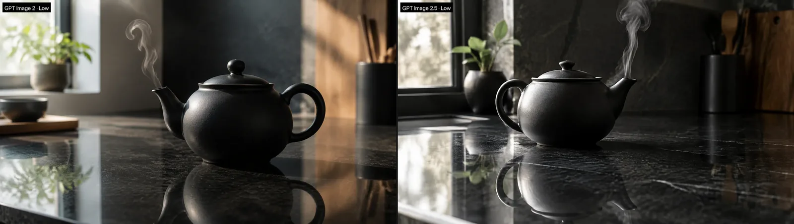
The teapot pair is the clearest illustration of what "resolved detail" means. Both get the pot's material right; the difference is the counter. 2.0's reflection is a vague dark smear. 2.5 mirrors the handle, body and lid one by one on the stone, with the marble veining showing through beneath. This is the weak spot I run into most often with any AI image generator — the subject is fine, the ring where subject meets environment goes mushy. 2.5 is noticeably denser in that ring.
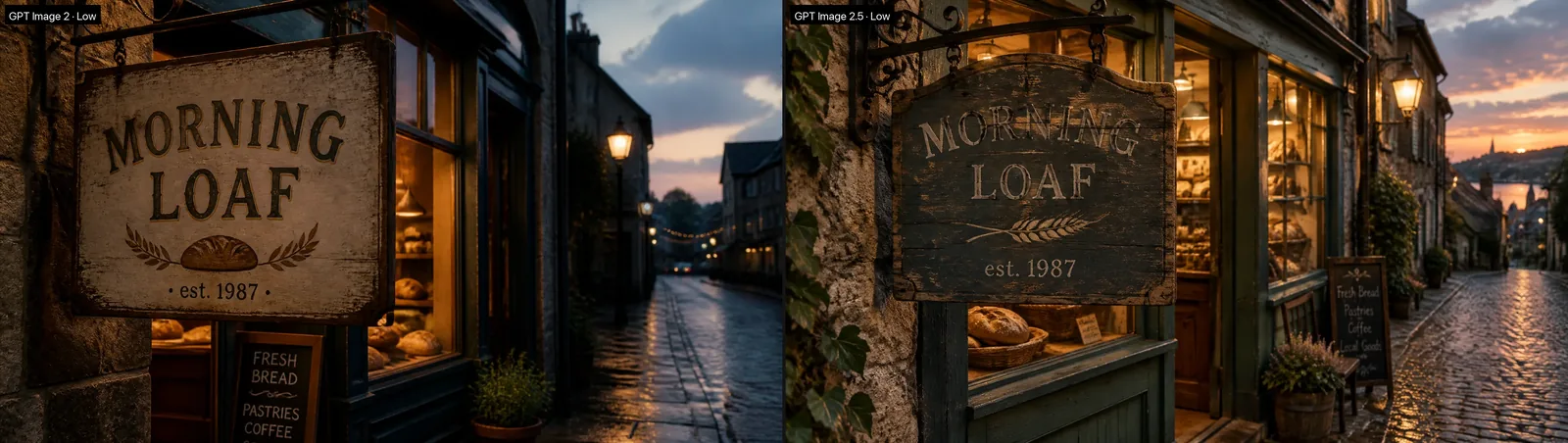
As for text in the frame: "MORNING LOAF · est. 1987" on the bakery sign and the three lines on the poster came out letter-perfect on both models. Readable typography has always been the GPT Image line's signature; 2.5 doesn't regress it, and it doesn't pull ahead either. The differences are around the letters. 2.5's sign is genuinely weathered wood hung on iron hooks, and its poster has fold creases and pin heads. 2.0's sign looks freshly painted, and its poster added a vintage car the prompt never asked for.
Difference two: three quality tiers become five
With GPT Image 2's three tiers, my rule was: Low is enough, Medium handles busy compositions, High rarely. 2.5 adds XHigh and Max above High, and the first reaction is "so, a more expensive High."
What I found was different: stepping up a tier doesn't sharpen the same image — it generates a new one. Across the Low, High and Max renders, the pin changed from a round crest to a leaf shape, and the layer underneath went from white shirt to cream sweater and back. Composition moved; the only thing that climbed steadily was the fabric. Max's herringbone is dense enough to count the threads, High is next, and Low is nearly indistinguishable from High at web size. So if your plan was "lock the composition on Low, then re-render the same frame at Max for print," that path doesn't exist. Move up the ladder while you can still accept the composition changing.

My advice is the same as it was with 2.0, just on a longer ladder: explore on Low, lock the composition, promote only the frame you're actually delivering. Which tier depends on how large it will be seen. A printed poster, a landing-page hero, a 4K plate — that's where XHigh and Max belong. Upgrading a social post just costs more.
Difference three: 4K widescreen and 16 reference images
4K is the tangible addition. GPT Image 2.5 outputs 3840×2160 and 2160×3840 directly, no 2K-then-upscale — and native versus upscaled is a different thing in high-frequency detail like leaves and hair.
One thing to know up front: 4K is only available for four wide and tall ratios — 21:9, 16:9, 9:16 and 9:21. The other seven aspect ratios top out at 3K. That's the model's pixel ceiling, not a ZOOOP limit; we grey out the combinations you can't select so you don't pay, wait half a minute, and get a failure.
The reference limit going from 10 to 16 images is a real convenience for e-commerce composites and layout work: product shots, props, a color card and a rough layout, all in one request, with the prompt describing the arrangement. I didn't shoot a comparison for this one, but "better at preserving the subjects in your reference photos" is one of the main threads in OpenAI's announcement, and it matches what we've seen in scattered tests in the AI image editor.
Difference four: do Flare and Sunburst render differently?
This was the one I most wanted to settle, because on ZOOOP the two versions cost the same. If Sunburst is slower and no better, what is it for?
I ran the lapel prompt from difference one through Sunburst with identical parameters. Side by side, the fabric density, the metal of the pin and the depth-of-field falloff are a wash; every difference is random — Flare gave a round brass button, Sunburst gave an oak-leaf pin and added a pocket square. In other words, for generating from scratch, Sunburst is not better than Flare.
It is slower, but I can't give you a number. I measured the same set of matched pairs twice; both rounds put Sunburst's median behind Flare, yet the gap differed a lot between them, and individual cells sometimes flipped. The direction holds. A multiplier doesn't. That lines up with OpenAI's positioning: Sunburst's strength is editing — the "change this one thing, leave the rest" kind — not text-to-image.
So the rule is simple. Default to Flare. Switch to Sunburst only when you're making a precise edit to an existing image and the change has to land exactly where you point. For text-to-image and batch drafts, Sunburst just makes you wait.
What to move to 2.5, and what to leave alone
Pulling the four differences into one list.
Move to GPT Image 2.5: anything that will be viewed large — printed key visuals, landing-page heroes, big-screen backdrops; anything with small text or dense typography; anything that needs native 4K widescreen; anything compositing a dozen-plus reference images. In these cases the gap is visible.
No rush: everyday social images, images only seen on a phone, pure style-exploration drafts. At Low, the difference between the generations isn't enough to justify re-running an existing set. If you have a batch made with GPT Image 2 and need a few more that match, staying on 2.0 is the safer bet.
For new work, start on 2.5. In ZOOOP's AI image generator it sits ahead of GPT Image 2 in the list, Flare is the default version, and the five quality tiers and 4K are all in the same panel. Credits are shared across both models, so switching back and forth doesn't need a second budget.