Why the long neck reads as funny
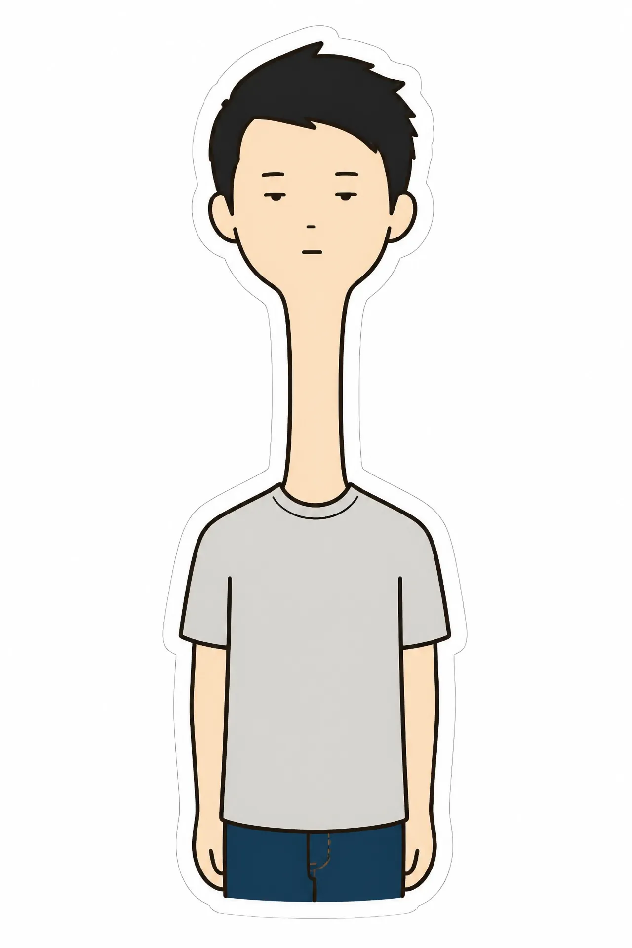
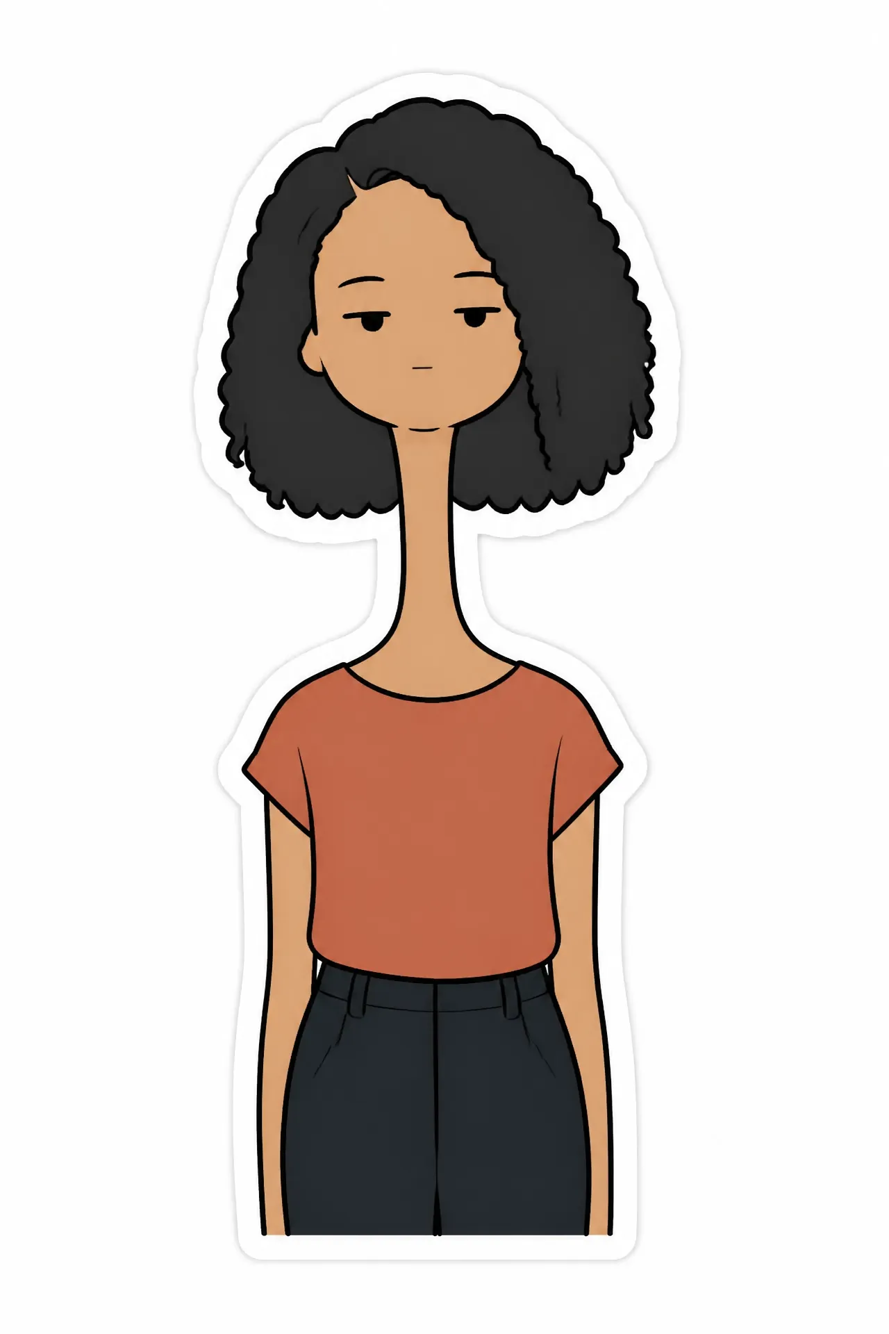
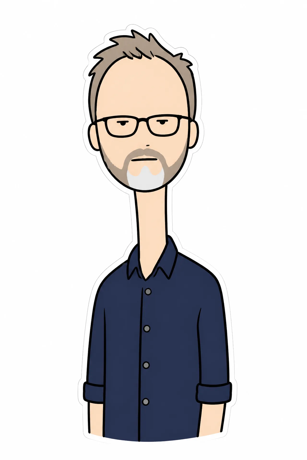
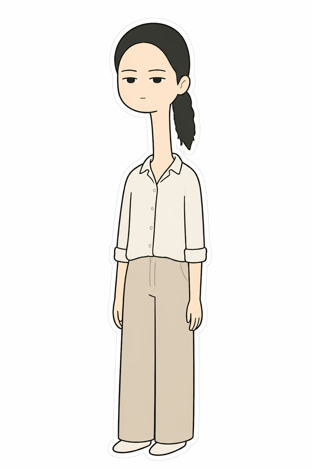
The joke is proportional, not visual noise. A face you recognise sits on a neck that is obviously wrong, with an expression that refuses to acknowledge it — that gap between a familiar likeness and an absurd body is where the humour comes from, and it is why the flat, minimal drawing style works better here than a detailed render would.
Getting a good one
A plain background and even lighting in your source photo make the biggest difference; heavy shadow across one side of the face tends to survive into the illustration as a smudge. Front-facing beats three-quarter. If the first take exaggerates too little, run it again rather than editing the prompt — the variation between takes is wider than any wording change you can make.